
Blog
Anime Color Palette: Character Design and Color Theory
The gist: Crafting an expressive anime color palette requires balancing base foundations, secondary support tones, and bold signature accents using the classic 60-30-10 design ratio. Testing palettes under grayscale values ensures high visual contrast and effortless translation into wearable streetwear outfits.
Color is the most immediate emotional language in visual storytelling. When an artist conceives a new character, the color scheme communicates moral alignment, combat temperament, and social role before a single background story is revealed. From cool monochromatic scouts to high-energy crimson rivals, a well-calibrated palette creates instant visual recognition and enduring aesthetic impact across dynamic illustrated panels.
However, bringing animated color concepts into real-world personal fashion requires understanding value contrast, hue saturation, and textile proportions. Translating bold character palettes into an adult wardrobe demands thoughtful restraint to avoid looking like a walking comic book. When done correctly, subcultural color blocking feels elevated, sophisticated, and intentional. Below is your comprehensive aesthetic guide to color theory in character illustration and how to translate expressive palettes into sophisticated streetwear ensembles.
| Character Archetype | Dominant Base Tone (60%) | Secondary Support Tone (30%) | Signature Accent Pop (10%) | Psychological Impact |
|---|---|---|---|---|
| The Stoic Strategist | Midnight Navy or Charcoal Slate | Cool Heather Grey or Ash White | Electric Cyan or Ice Blue | Calculated logic, emotional restraint, tactical calm |
| The Fiery Rival | Matte Obsidian Black | Deep Crimson or Rust Orange | Polished Gold or Brass | Aggressive ambition, competitive drive, unyielding resolve |
| The Forest Wanderer | Earth Muted Olive or Moss Green | Warm Sandstone Tan or Camel | Burnt Amber or Ochre | Wilderness survival, natural harmony, grounded wisdom |
| The Avant-Garde Rebel | Off-White Cream or Bone | Smoky Lavender or Muted Plum | Neon Acid Lime or Magenta | Unconventional thinking, artistic boldness, modern energy |
How do character artists build an anime color palette from scratch?
Character artists build an anime color palette by establishing a dominant base foundation, selecting a harmonious secondary support color, and adding a sharp, high-saturation accent pop to direct viewer focus toward essential visual details like eyes, emblems, or signature footwear.
Rather than picking random pleasing shades, professional artists anchor palettes in color psychology and narrative function. A character’s dominant base color represents sixty percent of their visual surface area, setting the overall emotional temperature.
Secondary colors provide depth and separation along seams, linings, and layering pieces. Finally, the signature accent pop occupies less than ten percent of the design, creating a focal spark that guides the viewer’s gaze across static illustrations.
By mapping out these tonal relationships during early conceptual sketches, illustrators ensure that the character remains instantly recognizable regardless of background lighting conditions or dynamic battle choreography.
How does the 60-30-10 color ratio govern wardrobe balance?
The 60-30-10 color ratio governs wardrobe balance by distributing sixty percent of an outfit to a neutral base garment, thirty percent to a complementary secondary layer, and ten percent to a vivid accent accessory, preventing visual chaos while ensuring cohesive aesthetic impact.
This classic interior and graphic design rule translates seamlessly into modern street fashion. When you examine sophisticated outfits, they avoid using three competing high-saturation colors simultaneously.
For example, a charcoal trench coat and matching tailored trousers provide the sixty percent neutral foundation. An ash grey knit sweater provides the thirty percent secondary bridge. A bold crimson beanie or custom painted footwear collar delivers the ten percent signature pop that ties the look together.
Adhering to this proportional balance prevents eye strain while giving your overall ensemble an intentional, editorial quality. When you limit high-chroma elements to small, deliberate focal zones, even unconventional accent shades like neon violet or acid yellow integrate seamlessly into sophisticated casual wear.
Why is the grayscale value test essential for visual clarity?
The grayscale value test is essential because converting a color palette to black-and-white reveals whether the design possesses sufficient lightness and darkness contrast, ensuring readability in print panels, low-light environments, and black-and-white comic formats.
Many novice designers make the mistake of pairing high-saturation red and green shades that share identical mid-tone gray values. In full color, the hues appear distinct; however, in grayscale or dim lighting, they blend into a muddy, indistinct silhouette.
By applying a black-and-white filter to your outfit sketches or digital mood boards, you can verify that your base, secondary, and accent tones occupy distinct points along the lightness spectrum from zero percent black to one hundred percent pure white.
How do you translate an animated color scheme into daily street style?
Translating an animated color scheme into daily street style requires toning down hyper-saturated primary colors into mature earthy or mineral shades, pairing structured neutral foundations with minimalist graphic apparel that reflects subcultural aesthetic appreciation.
The secret to adopting animated color schemes in daily life is substituting neon cartoon hues for rich mineral tones: swap neon yellow for mustard ochre, bright crimson for deep burgundy, and electric cyan for slate steel blue.
For fashion enthusiasts seeking thoughtfully curated graphic pieces with balanced tonal palettes, exploring collections from 8xGear offers versatile minimalist apparel, heavyweight tees, and outerwear designed to harmonize effortlessly with contemporary urban streetwear staples.
As covered in our workshop breakdown on footwear silhouette styling, pairing harmonious color palettes with intentional footwear volume creates a polished, expressive personal look that looks sophisticated in any casual or social setting.
What complementary and split-complementary color schemes work best?
Complementary and split-complementary color schemes work best by pairing opposite colors across the color wheel, such as deep navy with warm rust amber, to create striking visual tension while grounding the ensemble with neutral charcoal or cream undertones.
Split-complementary palettes take this balance a step further by pairing a base color with the two colors adjacent to its direct complement. This approach softens direct contrast while offering richer layering possibilities across outerwear, inner knits, and footwear accents.
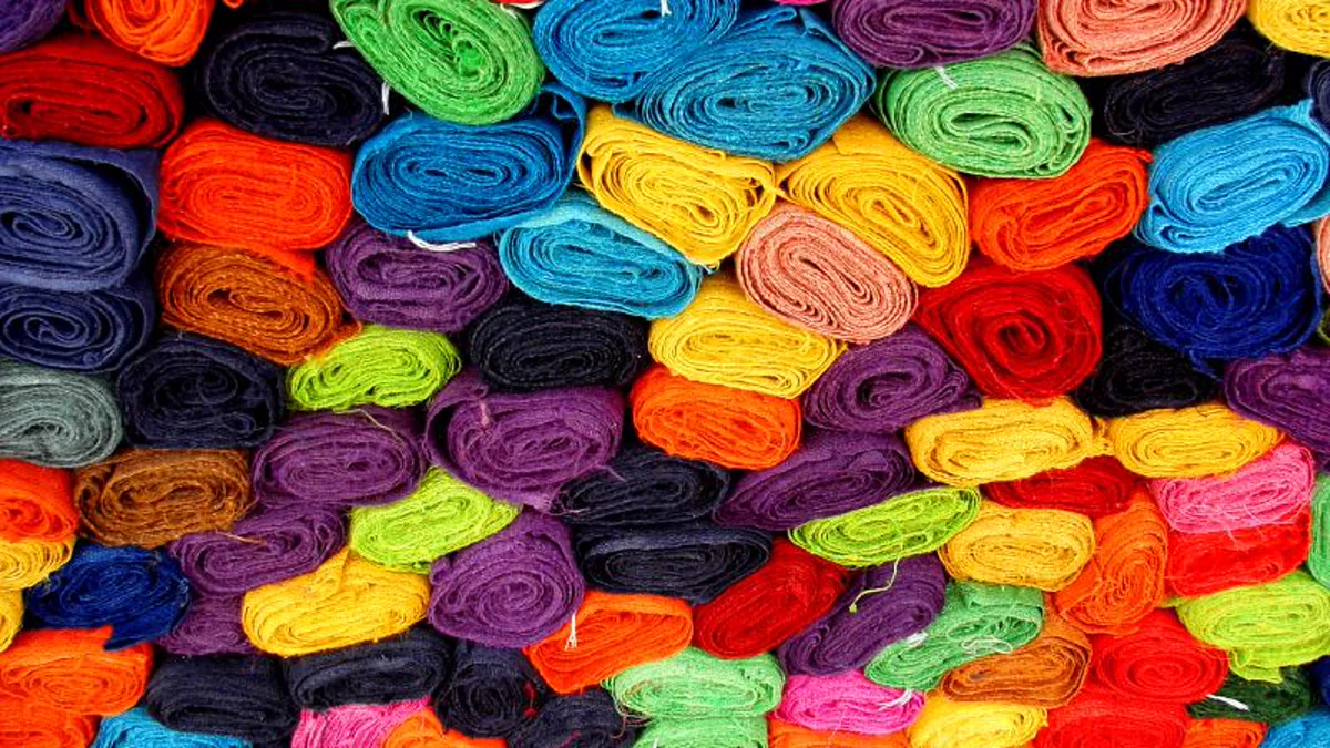
Another powerful approach is triadic color harmony, which selects three hues equidistant on the color wheel, such as olive green, muted indigo, and warm mustard. When executed in muted desaturated values, triadic schemes deliver rich visual variety without clashing. Temperature contrast between cool undertones and warm accent layers creates a sense of dynamic dimension across multi-layered autumn and winter ensembles.
When constructing personal outfits, experimenting with varying textile textures like heavy canvas, brushed fleece, and corduroy allows you to introduce subtle tonal shifts within a single color family. Mastering color interaction across different lighting conditions empowers designers to create versatile garments that retain their visual impact whether viewed under bright sunlight or dim indoor event spaces.
This textural layering creates sophisticated depth while adhering strictly to the sixty percent foundational base ratio, ensuring an effortlessly curated aesthetic appearance.
Applying structured color theory principles ensures that personal streetwear selections remain balanced, stylish, and expressive across diverse urban environments without overwhelming the surrounding visual composition. By understanding how base tones, secondary layers, and vivid accents interact under natural lighting, wardrobe enthusiasts can build versatile collections that reflect artistic appreciation.
By observing how shadows fall across natural fibers compared to synthetic weaves, you can fine-tune color balance with surgical precision. Heavy loopback cotton terry softens sharp accent borders, while coated water-resistant nylon sharpens color separation for a modern technical aesthetic.
How do seasonal fabrics interact with tonal color saturation?
Seasonal fabrics interact with color saturation through texture and weave density, where matte wool and brushed cotton absorb light to soften intense hues, while technical nylon and smooth leather reflect light to heighten accent brightness.
Understanding these textile light properties allows you to mix materials intelligently, pairing matte flannel shirts with semi-gloss leather boots for rich tonal depth.
Color palette design by the numbers
- 60-30-10 the universal proportional ratio for foundational, secondary, and accent color distribution (design standard).
- 3 maximum distinct hue families recommended per outfit to maintain aesthetic harmony (styling rule).
- 10 percent maximum visual area recommended for bold saturated accent pops (color theory principle).
- 0 to 100 percent lightness spectrum evaluated during black-and-white grayscale contrast audits (value testing).
- 4 core narrative archetypes establishing foundational palette psychology (strategist, rival, wanderer, rebel).
- 2 complementary accent shades maximum when constructing dual-tone outerwear palettes (styling guideline).
Why disciplined color theory elevates personal style
Disciplined color theory transforms clothing choices from accidental combinations into an intentional personal signature. By mastering the 60-30-10 balance rule and verifying tonal contrast through grayscale testing, you can construct versatile, dynamic outfits inspired by expressive artistic traditions. What color combination forms the foundation of your signature daily wardrobe?
Reader mail
What is the 60-30-10 color rule in fashion styling?
The 60-30-10 rule is a design ratio distributing sixty percent of an outfit to a base neutral, thirty percent to a secondary tone, and ten percent to an accent pop.
How do I test if my outfit colors have good contrast?
Take a smartphone photo of your outfit and apply a black-and-white grayscale filter to check if the light, medium, and dark values remain clearly separated.
Can I wear multiple bright accent colors in one outfit?
It is best to limit bright accents to one single focal piece (like a hat, scarf, or sneaker panel) to prevent visual competition and maintain harmony.
How do I make bright anime colors look wearable in everyday life?
Mute high-saturation shades into earthy or mineral equivalents, such as substituting bright yellow for mustard ochre and crimson for deep burgundy.
How we researched this: techniques, cure times and terms were checked against maker and reference pages. AI tools helped draft the article.
Sources: Digital color theory and contrast accessibility guide, Textile color formulation and seasonal trend archive, Visual art composition and tonal value documentation